Laura from NIEA and I battled our way through CSV files, KML files and buggy Google Fusion tables interfaces to make some interesting looking maps.
We were interested to see how arson crime in NSW is distributed according to geography, we though more arson crime would be occurring in country bushfire prone areas.
Using data from the NSW Government about arson crime data we were able to plot the places where arson occurs on a map. Not particularly useful because you can’t really see any detailed information. We then used electoral boundary data and fused it with the arson data to turn the points into larger more meaningful areas on the map. The link between area boundaries and arson data allowed us to colour code the areas according to how much arson has occurred there.
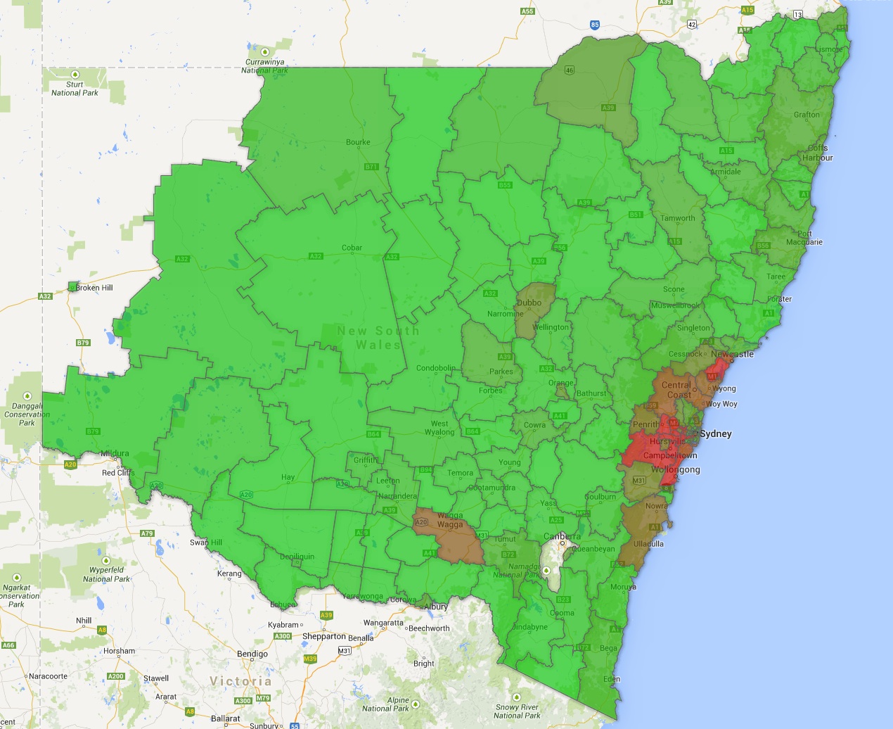
Before we began, we were expecting there to be more arson crimes in rural and outback areas. We realised on inspecting the raw crime values that the number of crimes are higher in urban areas due to the higher population density so we should have normalised the data using population density. That can be a task for another time…